CCA SUCKS:
Voices of Concerned Students, Staff, and Faculty
About CCA Sucks
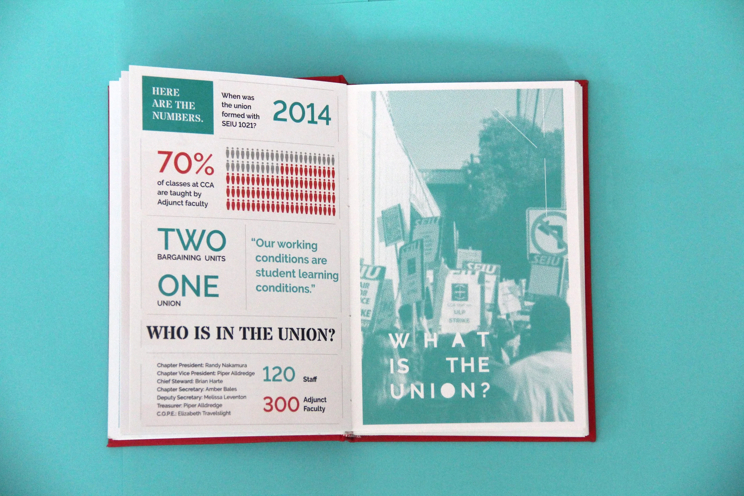
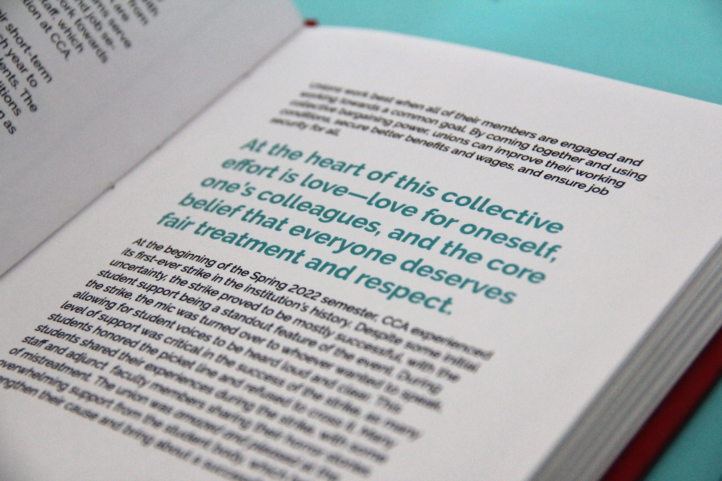
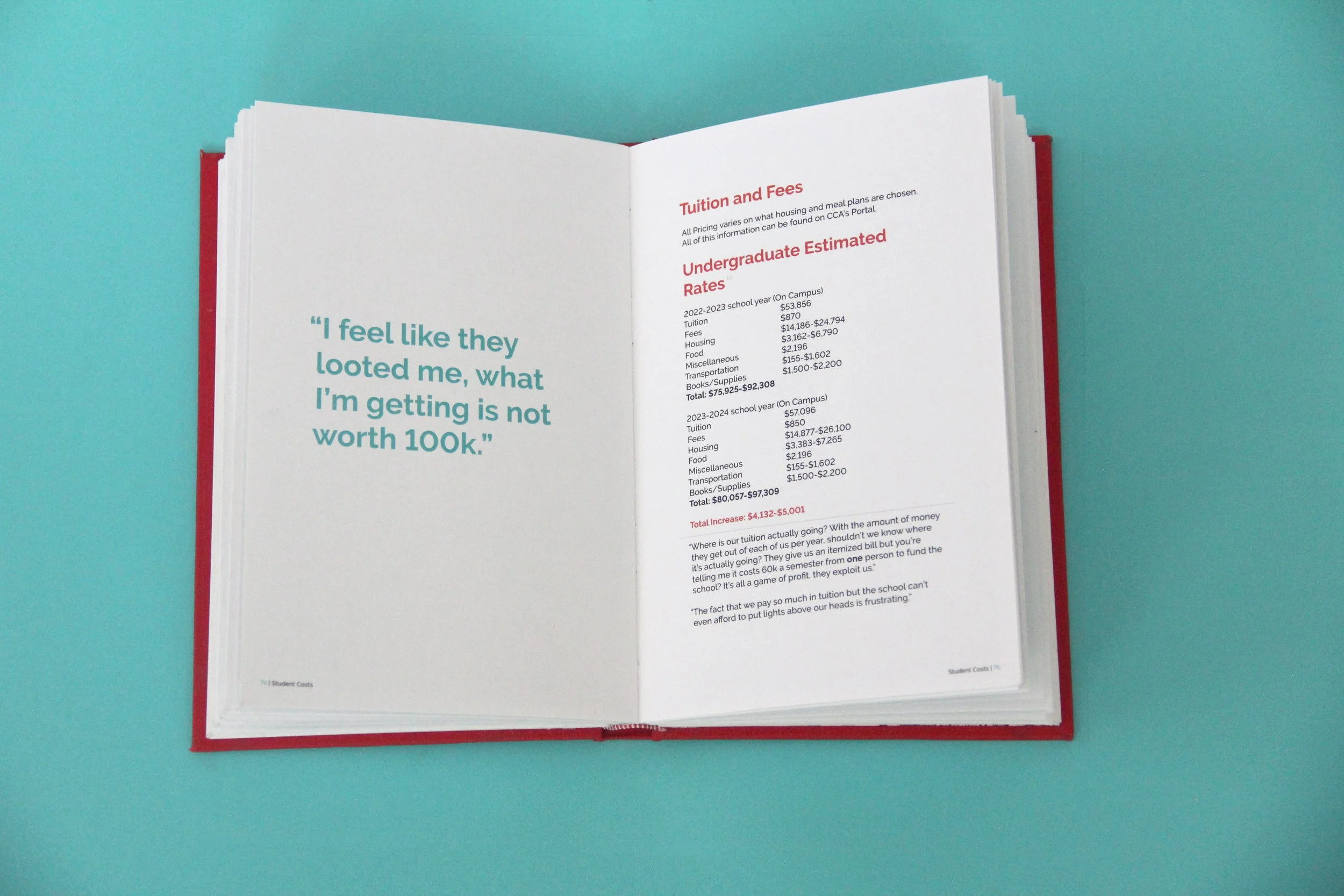
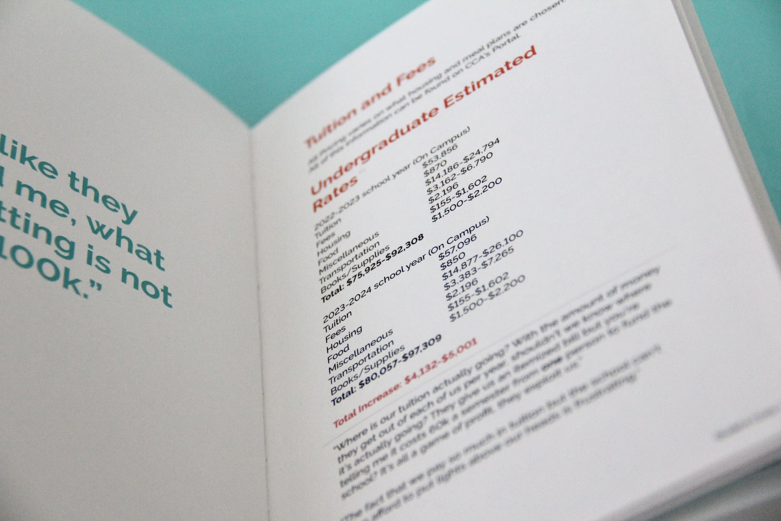
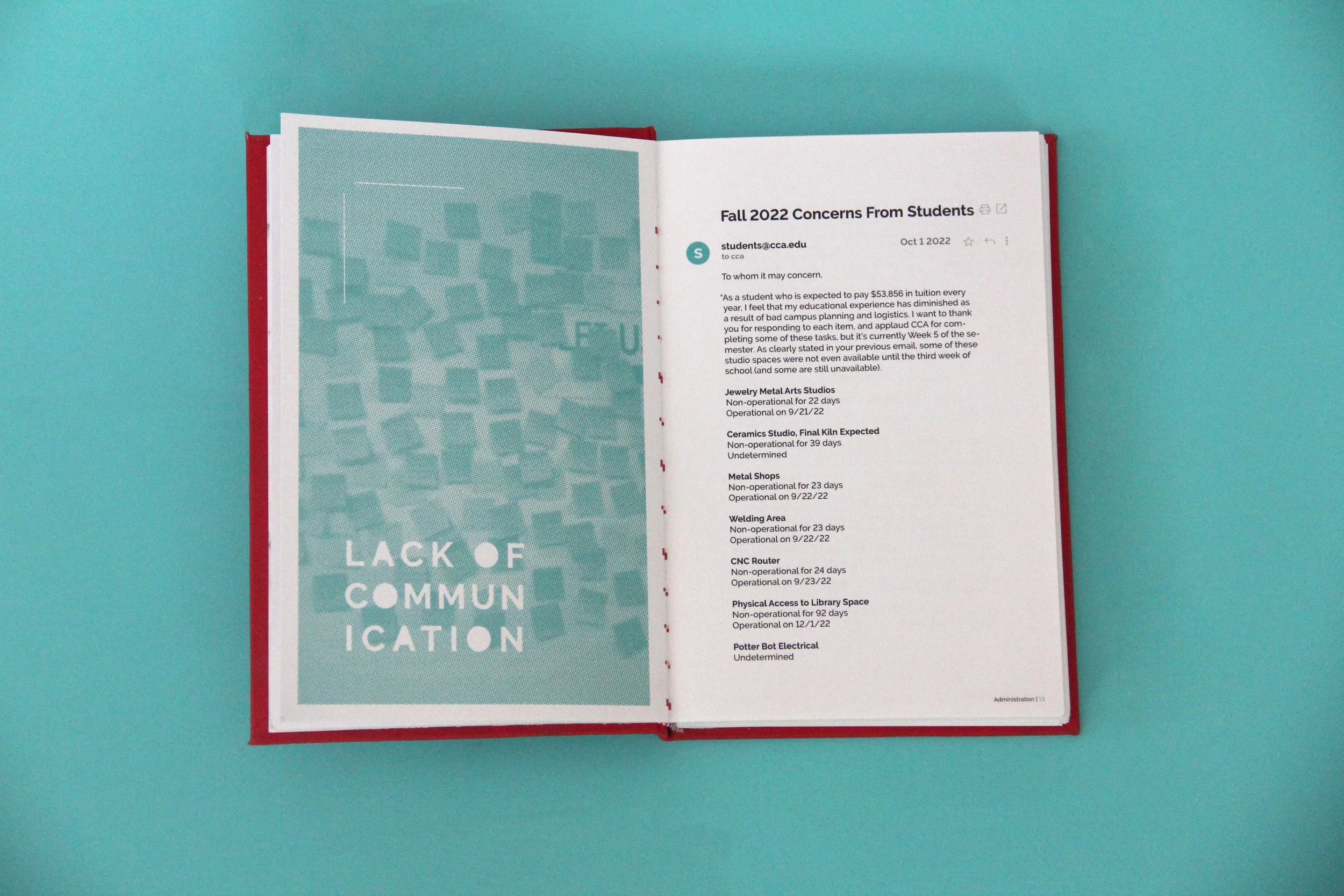
CCA Sucks: Voices of Concerned Students, Staff, and Faculty is a chronicle of the persistent challenges faced by those working at and attending California College of the Arts (CCA) during the 2022-2023 academic year. Amidst the chaos and disruption caused by the merging of the two campuses, the college community was forced to navigate a range of issues, including the displacement of the fine arts programs and the disruption of classes and facilities.
To give voice to the concerns and frustrations of students, staff, and faculty, a form titled Pissed at CCA? was opened during the Fall semester of 2022, allowing individuals to express their thoughts anonymously. These responses were then carefully organized into nine separate sections, offering a broader perspective on institutional issues and the impact they have had on different groups within the college community.
Overall, CCA Sucks offers an unflinching look at the challenges faced by those within the CCA community during a particularly disruptive academic year.
Colors
New Teal
-
C: 76% / M: 0% / Y: 38% / K: 0%
R: 0 / G: 191 / B: 179
HEX: 00BFB3
-
CCA’s main teal was used to portray the voices of students, staff, and faculty. It provided emphasis in paragraphs and pull quotes, as well as highlighted source material.
Original Red
-
C: 0% / M: 82% / Y: 94% / K: 2%
R: 207 / G: 69 / B: 32
HEX: CF4520
-
CCA’s original red was used to portray the voices of administration, whos voice was provided through the school’s Portal website and emails sent to the student body. It provided emphasis in paragraphs and pull quotes, as well as highlighted source material.
Black
-
C: 0% / M: 0% / Y: 0% / K: 100%
R: 0 / G: 0 / B: 0
HEX: 000000
-
Black was used for main body text and titles.
Process Work
During the Fall 2022 semester, I created two versions of the opening chapter as compact zines. The first edition was produced using a risograph, utilizing red, blue, and black ink drums. Originally, I chose this method for its quick production turnaround, but encountered an obstacle in the shifting of layers, as only one layer could be printed at a time.
For the second iteration, I opted for digital printing, resulting in a more polished design. However, this method proved to be more expensive. Additionally, this marked the first attempt where I experimented with adhering to California College of the Art's brand guidelines and core color scheme.
When it came to the final iteration, I printed and hand bound nineteen copies of the book. Ten were hardcover bound and nine were left as book blocks. Hardcover copies were donated to the Graphic Design program, the Staff and Adjunct Faculty Union, and the CCA Library. All three iterations of my project have been put on the shelves of the CCA Library for future students to read and use.


